
Step Into the Cyberpunk Realm
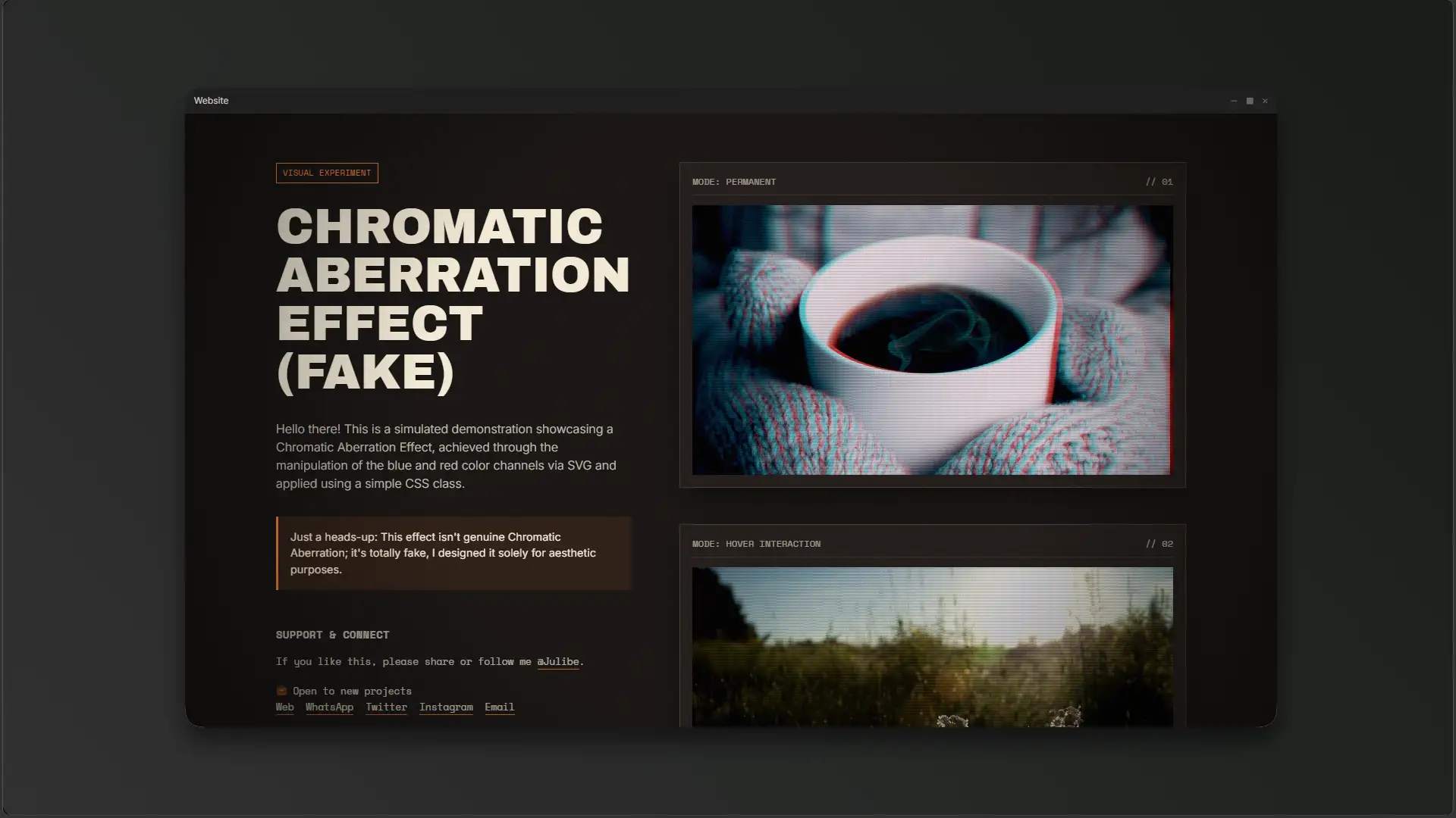
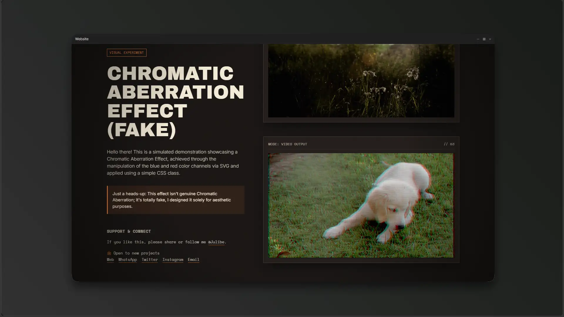
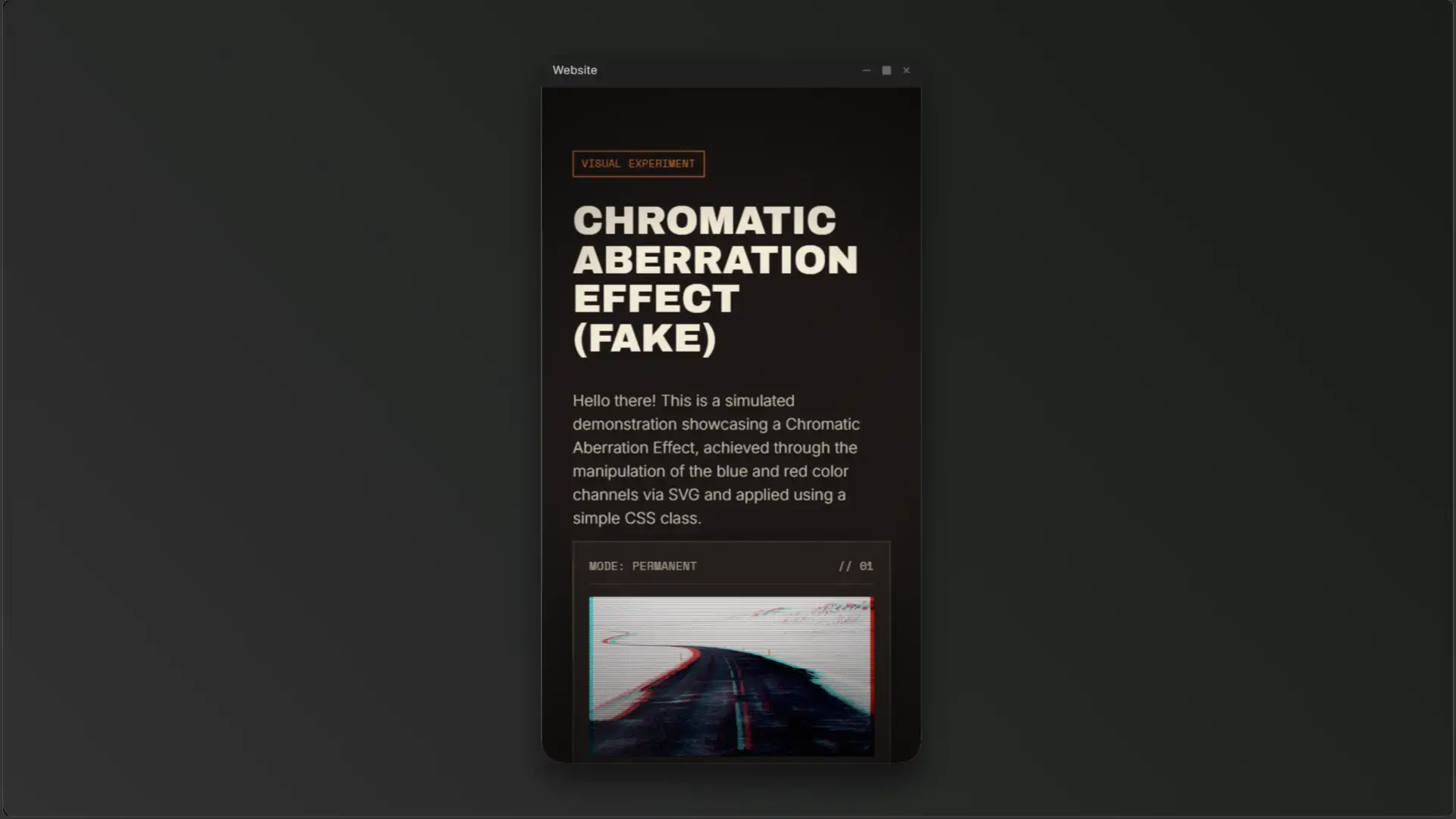
Welcome to the ultimate digital optical illusion! The Fake Chromatic Aberration Effect is a thrilling visual experiment that brings the raw, imperfect beauty of analog technology straight to the modern web browser. It perfectly replicates the iconic red and blue color bleed seen in vintage camera lenses and classic CRT monitors.
Harnessing Raw Optics
This project is all about pure CSS and SVG wizardry. By utilizing highly optimized SVG filter matrices, we split the image channels to create a mesmerizing, retro-futuristic Glitch. Wrapped in a moody, dark-mode terminal layout with custom CSS noise and radial vignettes, this effect transforms ordinary images and videos into cinematic masterpieces. Get ready to hack the mainframe!