The Pulse of Data
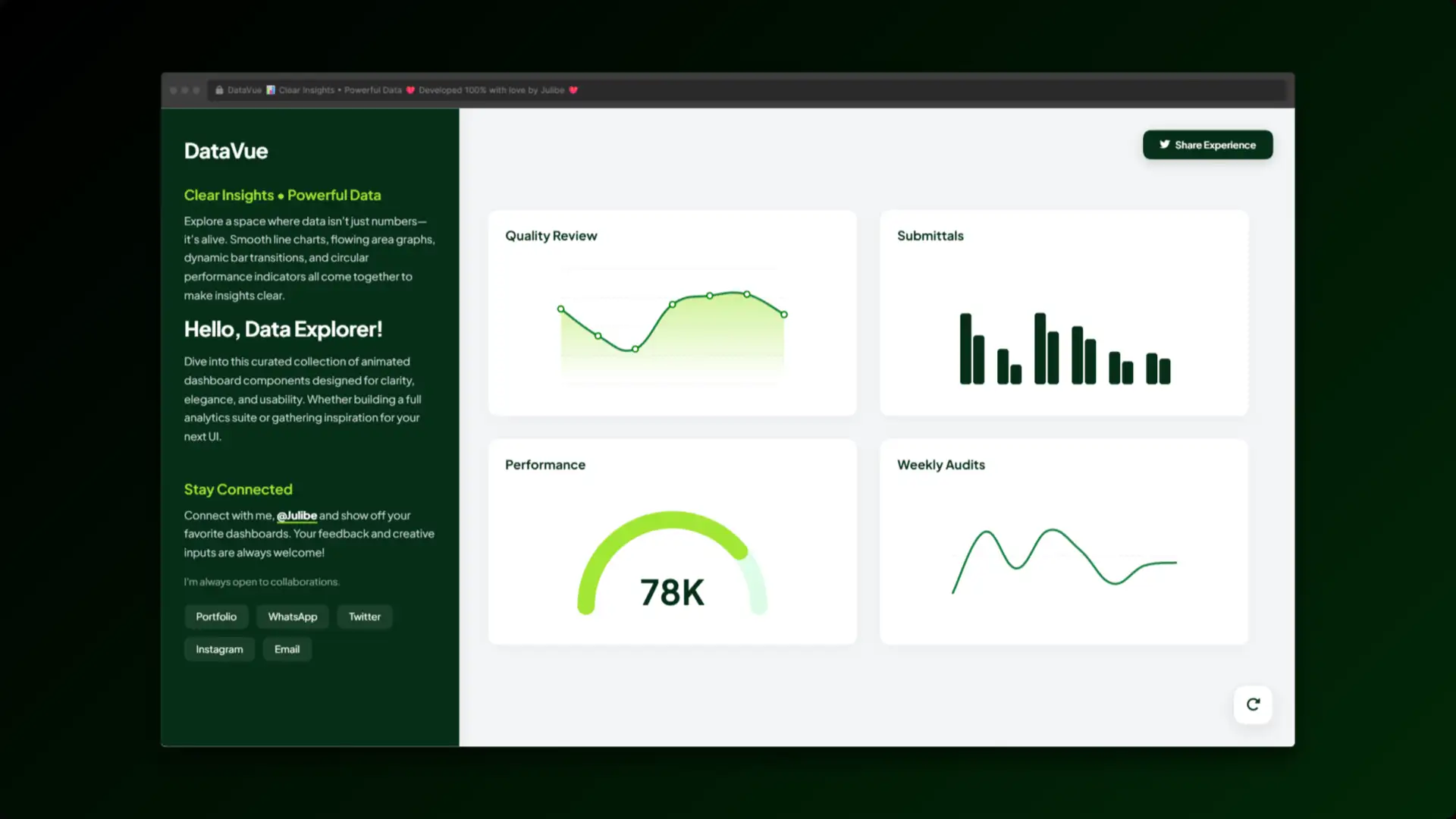
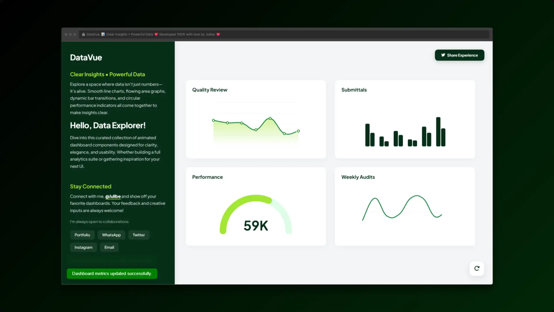
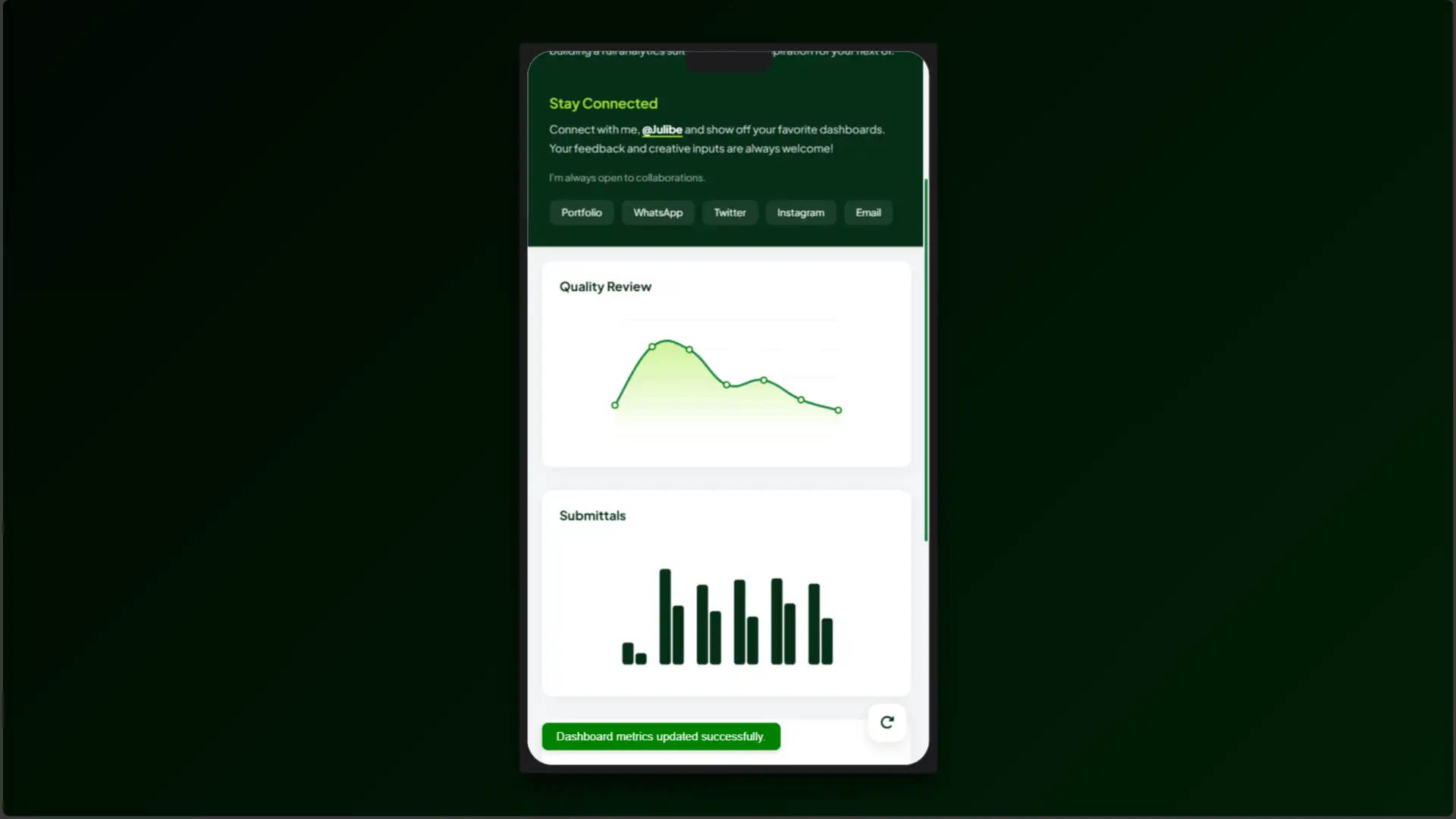
DataVue is an exploration into the aesthetics of analytics, designed to prove that metrics don’t have to be visually stagnant. In a digital ecosystem where data drives every crucial decision, the way we present that data is just as vital as the numbers themselves. This project transforms rigid, uninspired charts into a living, breathing canvas of information.
A Visual Symphony
Through a careful orchestration of color, layout, and motion, DataVue elevates the user’s cognitive absorption of complex figures. The design leverages a high-contrast ‘Deep Forest & Lime’ palette that immediately draws the eye to key performance indicators, ensuring that critical insights are never lost in the noise. By turning static submittals and weekly audits into fluid, animated journeys, the dashboard creates an engaging narrative out of raw numbers.
Redefining Interactions
Under the hood, the elegant visual experience is powered by precise, mathematical geometry translated seamlessly into the browser. It demonstrates how lightweight, custom-built visual elements can outperform heavy, clunky libraries, delivering a sleek, professional, and entirely bespoke interface that invites clients to interact, understand, and act upon their data. Don’t let your data sit in silence-click the view button below to experience the live analytics dashboard for yourself!